素晴らしい本です。判型が小さいですが、それが最大の欠点でもあり、この本を成り立たせている要因でもあります。
ミュシャには詳しくありませんが、こんなに沢山の作品を一冊に収めるのは大変だったんじゃないでしょうか。作品によっては下絵や習作も掲載されていて、とても参考になります。
『スラブ叙事詩』は別として(ミュシャの油絵・テンペラ作品をはじめてみた気がします)、有名なポスター作品は全てしっかりと輪郭が描かれていて、浮世絵の影響のようなものを感じます。ミュシャが生まれたのが1860年。葛飾北斎が亡くなったのは1849年。そんなに年代が離れているわけではないですね。北斎は長生きだったので、生まれた年1760年と比べるとちょうど100年です。ロートレックは1864年生まれ、ゴッホが1853年生まれ、ガウディは1852年生まれです。
ポスター作品は『リトグラフ』で作成されています。「リトグラフ」は平板画で結構製版が面倒ですが、版画ですので何枚も印刷ができます。ミュシャは印刷所の性能によって版数(色数)を分けていると思います。
通常の一点物の絵画に比べると価格は低いでしょうが、作品としては素晴らしいものばかりです。CGでも、こんなに素晴らしい作品はできません。というか、ミュシャのデッサン力とデザイン力が見事にリトグラフで表現されています。
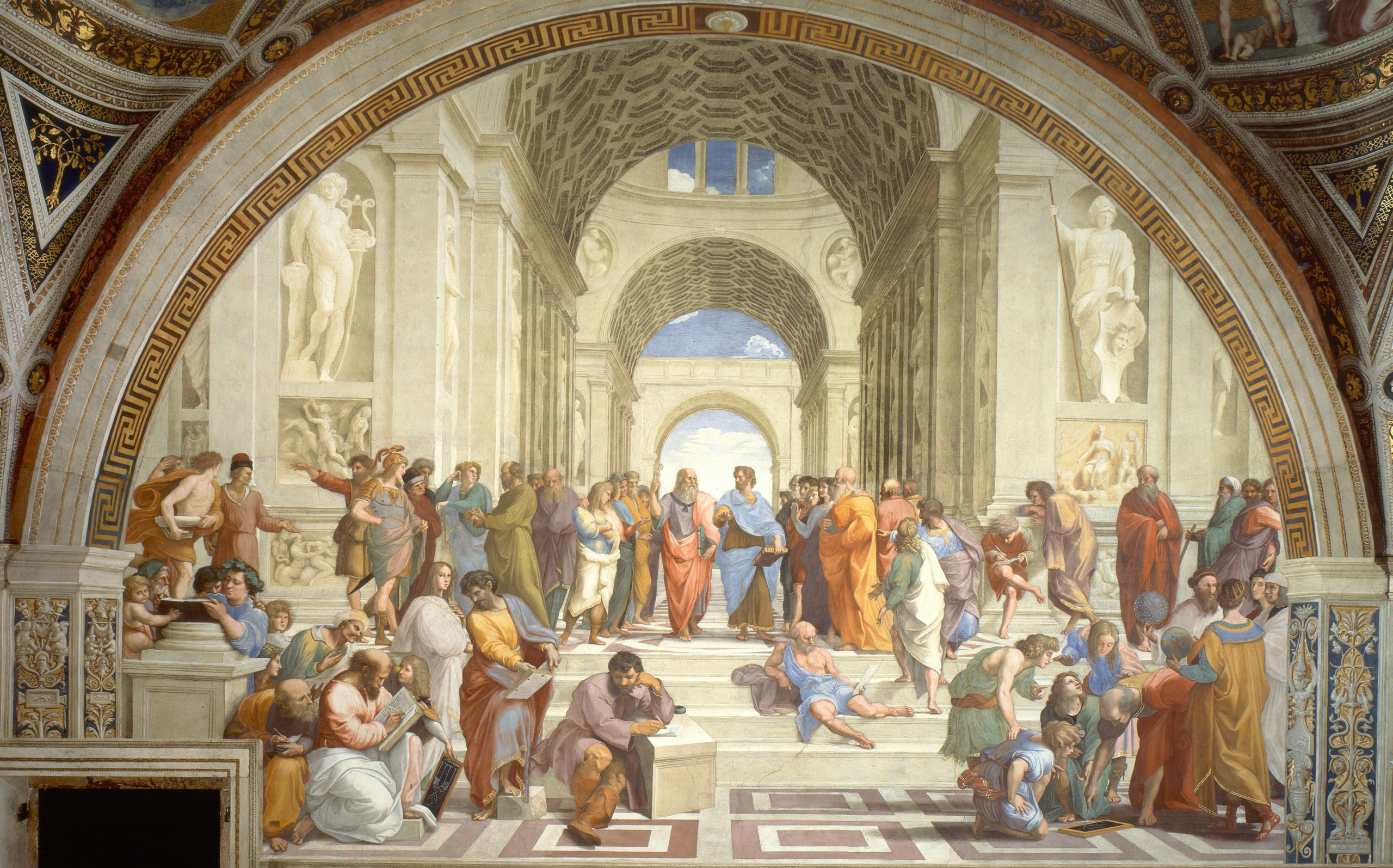
そのデッサン力は、絵画作品にも現れています。ただ、『スラブ叙事詩』は、なんとなくまとまりがないように思います。リトグラフは、人物が一人か二人なので、素直にまとまります。同じように人物をたくさん描いていても、ラファエロの『アテナイの学堂』なんかはうるさくないですよね。その差は全体の空間の取り方(余白というか、人物が描かれていない空間)と強調、非強調、視線の向き、人物の動線等によるように思います。また、水平、垂直、三角形などの構図が伝統絵画と異なると思います。
多分、それはミュシャの「スラブ」とその歴史に対する思いの深さ、大きさが現れているのではないでしょうか。
⟨impressions⟩
It’s a great book. Although the format is small, it is also the biggest drawback and the factor that makes this book possible.
I’m not familiar with Mucha, but I think it was difficult to put so many works in one book. Depending on the work, sketches and studies are also posted, which is very helpful.
Apart from “Slavic Epic” (I feel like I’ve never seen Mucha’s oil paintings and tempera works), all the famous poster works are well outlined and feel like the influence of ukiyo-e. Mucha was born in 1860. Katsushika Hokusai died in 1849. It’s not that old. Hokusai lived a long time, so it’s just 100 years compared to his birth year of 1760. Lautrec was born in 1864, Van Gogh was born in 1853, and Gaudi was born in 1852.
The poster work is made with “lithograph”. “Lithography” is a flat print and it is quite troublesome to make a plate, but since it is a print, you can print many sheets. I think Mucha divides the number of plates (number of colors) according to the performance of the printing shop.
It’s cheaper than a regular one-of-a-kind painting, but it’s a great piece of work. Even with CG, you can’t make such a wonderful work. Rather, Mucha’s drawing power and design power are beautifully expressed in lithographs.
That drawing power is also reflected in his paintings. However, I think the “Slavic epic” is somehow disorganized. Lithographs are straightforward because there are only one or two people. Even if you draw a lot of people in the same way, Raphael’s “The School of Athens” is not noisy. I think that the difference depends on how to take the whole space (margin, or space where no person is drawn) and emphasis, non-emphasis, direction of line of sight, flow line of person, etc. Also, I think the composition of horizontal, vertical, and triangular shapes is different from traditional paintings.
Perhaps it is a manifestation of Mucha’s “slab” and the depth and size of his thoughts on its history.
[出演者(プロフィール)等]
執筆者 冨田章、白田由樹、小野尚子
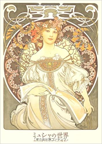
優美にして華麗。アール・ヌーヴォーの寵児が描く「様式の美」。ポスター、装飾パネル、工芸デザイン、傑作“スラヴ叙事詩”。ベルエポックに花開いた芸術家の珠玉の作品を完全収録。
アテナイの学堂